A list of example widgets with usage explanations.
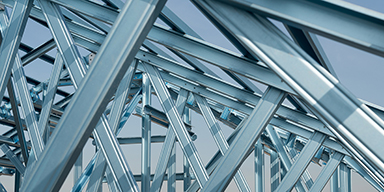
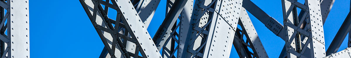
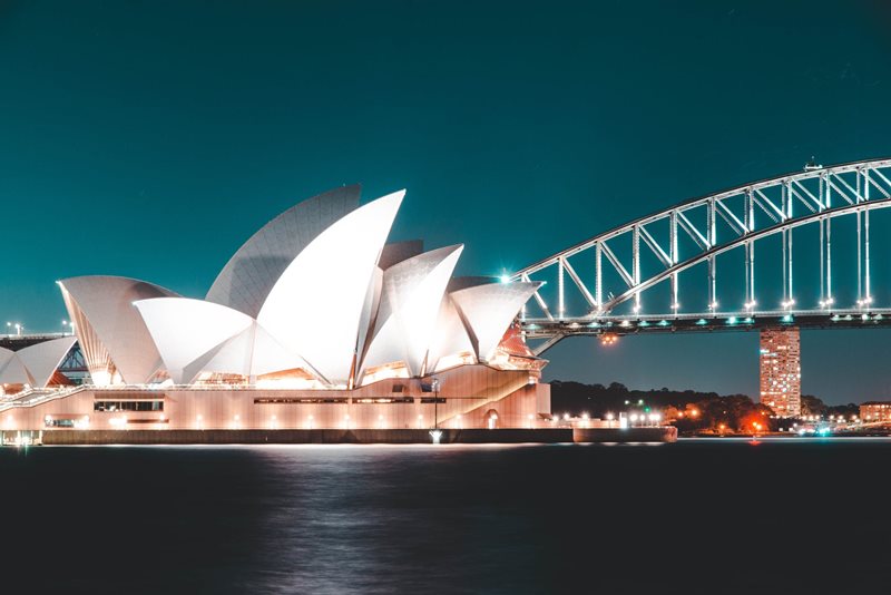
Brookfield Multiplex’s iconic external ‘diagrid’ steel-framed building at King Street Wharf precinct follows on from the successful completion of the nearby Ernst & Young Tower and Latitude East buildings in Sydney’s CBD.
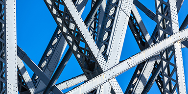
Brookfield Multiplex’s iconic external ‘diagrid’ steel-framed building at King Street Wharf precinct follows on from the successful completion of the nearby Ernst & Young Tower and Latitude East buildings in Sydney’s CBD.
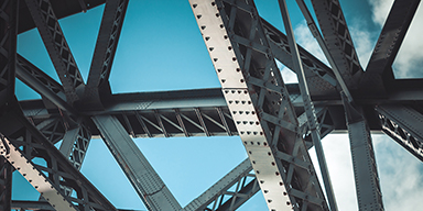
Brookfield Multiplex’s iconic external ‘diagrid’ steel-framed building at King Street Wharf precinct follows on from the successful completion of the nearby Ernst & Young Tower and Latitude East buildings in Sydney’s CBD.
Brookfield Multiplex’s iconic external ‘diagrid’ steel-framed building at King Street Wharf precinct follows on from the successful completion of the nearby Ernst & Young Tower and Latitude East buildings in Sydney’s CBD.
Brookfield Multiplex’s iconic external ‘diagrid’ steel-framed building at King Street Wharf precinct follows on from the successful completion of the nearby Ernst & Young Tower and Latitude East buildings in Sydney’s CBD.
Brookfield Multiplex’s iconic external ‘diagrid’ steel-framed building at King Street Wharf precinct follows on from the successful completion of the nearby Ernst & Young Tower and Latitude East buildings in Sydney’s CBD.
Brookfield Multiplex’s iconic external ‘diagrid’ steel-framed building at King Street Wharf precinct follows on from the successful completion of the nearby Ernst & Young Tower and Latitude East buildings in Sydney’s CBD.
Brookfield Multiplex’s iconic external ‘diagrid’ steel-framed building at King Street Wharf precinct follows on from the successful completion of the nearby Ernst & Young Tower and Latitude East buildings in Sydney’s CBD.
Anim aute id magna aliqua ad ad non deserunt sunt. Qui irure qui lorem cupidatat commodo. Elit sunt amet fugiat veniam occaecat fugiat aliqua.
Anim aute id magna aliqua ad ad non deserunt sunt. Qui irure qui lorem cupidatat commodo. Elit sunt amet fugiat veniam occaecat fugiat aliqua.
Anim aute id magna aliqua ad ad non deserunt sunt. Qui irure qui lorem cupidatat commodo. Elit sunt amet fugiat veniam occaecat fugiat aliqua.


Hero Sub Title
.jpeg?variant=HalfWidth)
.jpeg?variant=HalfWidth)

.jpeg?variant=HalfWidth)
Landing Page Link (Multi-Page)
Add a link to existing pages. Ensure that the pages have an image, title and meta description as well as a publish date and read time. Use in empty column. Add the amount of articles you need with the counter.
Intro Text
We care about the protection of your data. Read our Privacy Policy.
Access to free events
Discount books
Access to resources
Test Item
Lorem ipsum dolor sit amet, consectetur adipiscing elit. Vivamus quis metus id lacus luctus luctus.
Access to free events
Discount books
Access to resources
Test Item
Lorem ipsum dolor sit amet, consectetur adipiscing elit. Vivamus quis metus id lacus luctus luctus.
Access to free events
Discount books
Access to resources
Test Item
Lorem ipsum dolor sit amet, consectetur adipiscing elit. Vivamus quis metus id lacus luctus luctus. Cras ut nisl vel sapien lobortis suscipit sed in metus. Integer euismod orci et risus consequat fringilla. Etiam vulputate turpis risus, ut tristique libero fermentum a. Fusce ultricies, velit vel finibus interdum, nisi risus commodo elit, id fermentum velit metus eu purus. Proin at arcu sollicitudin, semper justo non, consectetur risus. Suspendisse interdum ullamcorper urna, ac lacinia dolor egestas facilisis. Proin ultricies bibendum metus ac porta. Nullam venenatis tempus urna, id gravida magna tincidunt sit amet. Phasellus sed ante sed sapien venenatis facilisis non non nibh. Aliquam erat volutpat. In fringilla pellentesque dolor in facilisis. Pellentesque ipsum massa, bibendum at laoreet at, vehicula a justo. Duis efficitur fringilla orci vel suscipit.
| Header 1 | Header 2 | Header 3 | Header 4 |
|---|---|---|---|
| Data | Data | Data | Data |
| Data | Data | Data | Data |
| Data | Data | Data | Data |
Small, Medium and Large gaps.
Small Gap Below
Medium Gap Below
Large Gap Below
Display key statistics. Use with Empty Section.
Get access to resources, eBooks and special events.
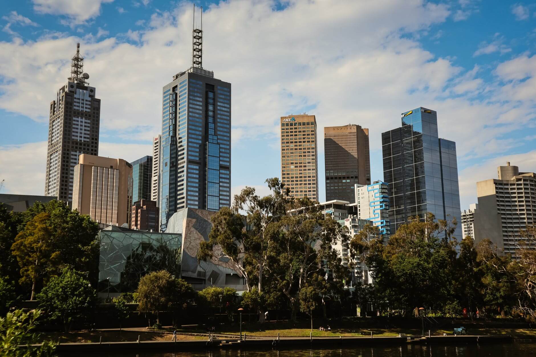
Brookfield Multiplex’s iconic external ‘diagrid’ steel-framed building at King Street Wharf precinct follows on from the successful completion of the nearby Ernst & Young Tower and Latitude East buildings in Sydney’s CBD.
Developer
Heritage architect
Building Contractor
Developer
Developer
Heritage architect
Building Contractor
Developer
.jpeg?variant=HalfWidth)
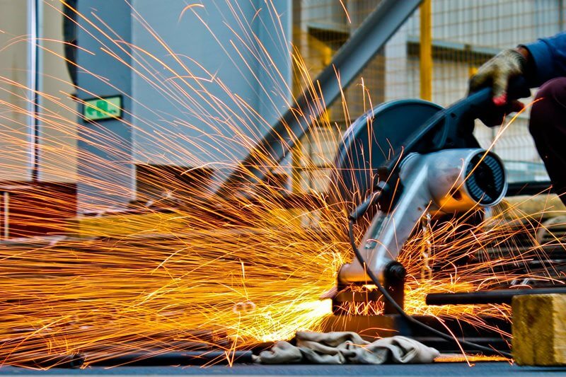
Brookfield Multiplex’s iconic external ‘diagrid’ steel-framed building at King Street Wharf precinct follows on from the successful completion of the nearby Ernst & Young Tower and Latitude East buildings in Sydney’s CBD.
.jpeg?variant=HalfWidth)
Brookfield Multiplex’s iconic external ‘diagrid’ steel-framed building at King Street Wharf precinct follows on from the successful completion of the nearby Ernst & Young Tower and Latitude East buildings in Sydney’s CBD.
.jpeg?variant=HalfWidth)
Brookfield Multiplex’s iconic external ‘diagrid’ steel-framed building at King Street Wharf precinct follows on from the successful completion of the nearby Ernst & Young Tower and Latitude East buildings in Sydney’s CBD.
Brookfield Multiplex’s iconic external ‘diagrid’ steel-framed building at King Street Wharf precinct follows on from the successful completion of the nearby Ernst & Young Tower and Latitude East buildings in Sydney’s CBD.
.jpeg?variant=FullWidth)
.jpeg?variant=HalfWidth)
.jpeg?variant=HalfWidth)
.jpeg?variant=HalfWidth)